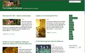
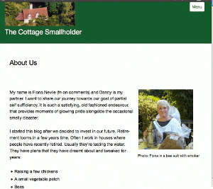
New layout for CSH – testers wanted please
Posted by Fiona Nevile in Cottage tales | 89 comments
Photo of our Cottage Smallholder cottage from the air
Danny here, everybody.
14% of our visitors use mobile devices, such as tablets, iPad, smart mobiles and so on. Interestingly, 85% of those are Apple.
So it makes sense to adjust the presentation to improve readability for this growing segment while ensuring that users of normal computers and laptops remain unaffected.
The site looks very different since we made the switch at 07:30 this morning but the content remains the same.
We would very much welcome comments here on this article from mobile device users and “normal” computer users alike. Even if it’s just to say “looks fine on my xyzsuperwotsit” or “the buttons are way off the screen on my abcamazatron”.
Desktop and laptop users can partly simulate what it looks like on a smaller screen device by making your browser window smaller and resizing it by dragging the edges. If you don’t know how to do that then don’t worry. It is not necessary to try it.
Edit: Friday May 11
Some visitors have observed unusual manifestations!
Here are three screenshots – thank you very much,Celia -from a Mac laptop . .
These are intended to give you an idea about how the site should appear. If it looks different on your browser then plaease tell us. Obviously it will be different on small screen devices.
Update Sat May 12: Well, I have to concede that this new theme/layout is simply not good enough, as many of you have pointed out.
It does not work on IE8 and looks horrible on a screen width of 1024 (thanks, Simon). Those two factors alone mean that over 20% of our visitors either cannot get onto the site or have a bad experience.
Thank you very much to everybody who took the time and trouble to test it out and leave a comment with feedback. A true community effort!
Today I will research better alternatives, so expect some more changes but then we stop changing, hopefully, for the next six years.
Update Mon May 14 2012
This theme/layout that we installed on Saturday is far better. It will take a few days to get it working and looking exactly as we want but so far so very good.
Leave a reply


All ok on my iPad but it would be good if I could use the emoticons.
So, where it the forum today? Or are Val and I the only ones to be locked out?
Works fine on Firefox 3.6.28 on XP SP3; centre column is as wide as the left, which was slightly confusing at first. I’m afraid I like the buttons non-raggedy too, but suspect I’m just showing my age!
Totally broken in IE8 on the same machine. Won’t even load, IE just shuts down. No sensible error message as to why.
Displays fine (in fact, better than on the laptop) in the Android web browser (2.1) on the Moto Defy. Everything displays in a single column, although I have the option to move to the right as there seems to be quite a bit of whitespace. The only thing that seems to be missing is the Search field, but I don’t know if that’s supposed to be there.
Thanks, Sarah.
The search box should appear top right, and also at the bottom on mobiles.
Three reports now that it breaks IE8. Beyond my capability to fix but I have raised a support ticket.
Raggedy buttons are here to stay. Watch the world follow our example! 🙂
Looks fine on my IPad2 both!
Thanks, Luffy.
Danny { I am not seeing what you are, Steve. It says your comment above is timed at 2:08 pm. Unless you are referring to something else? } “ Wed, 03:12 <—— 😉
Finally got it, Steve. In the Recent Comments list at the bottom of the page the time format was wrong. Thanks for persisting!
Prefer the menu bar horizontal, saves scrolling down, the piture of the cottage looks lost in the green banner, Preferred the old format.
Bob, you are right about the header and the picture. I need to go back to the books to learn how to improve it. But the buttons will stay. Recent thinking says to put the article content in front of the reader asap. And anything between the header picture and the opening sentence reduces that objective, especially on smaller screens.
Glad you managed to get past the “bugger trap”. I did remove it. Thanks.
Reading this on Windows Vista Business – all crisp and clean, buttons etc all in a row. Can’t help thinking that it’s a bit too slick for ‘cottage’ smallholder image?
Hmmmm. Fair point, Linda.
Don’t worry. If you saw our house you would realise that we have a fantastic inherent antipathy towards “crisp and clean”. It won’t take us long to re-clutter the site 🙂
Thanks for commenting.
Windows XP & Google…..
Have found that if I have my favourites bar visible on the left hand side things seem to sort themselves out a bit and the blog text becomes the main section again, though reading through other comments I am wondering if I am missing some photos as the layout I have is v plain? The buttons are all present on the right now and the adverts have moved back to right as well. Will keep fiddling
Works well on my iPad which makes me happy ’cause it didn’t the last few days 🙂
Good stuff. Thanks, Lynn.
It also appears that the message timer is 12hours adrift!! 😉
I am not seeing what you are, Steve. It says your comment above is timed at 2:08 pm.
Unless you are referring to something else?