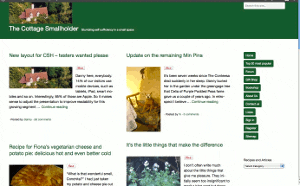
New layout for CSH – testers wanted please
Posted by Fiona Nevile in Cottage tales | 89 comments
Photo of our Cottage Smallholder cottage from the air
Danny here, everybody.
14% of our visitors use mobile devices, such as tablets, iPad, smart mobiles and so on. Interestingly, 85% of those are Apple.
So it makes sense to adjust the presentation to improve readability for this growing segment while ensuring that users of normal computers and laptops remain unaffected.
The site looks very different since we made the switch at 07:30 this morning but the content remains the same.
We would very much welcome comments here on this article from mobile device users and “normal” computer users alike. Even if it’s just to say “looks fine on my xyzsuperwotsit” or “the buttons are way off the screen on my abcamazatron”.
Desktop and laptop users can partly simulate what it looks like on a smaller screen device by making your browser window smaller and resizing it by dragging the edges. If you don’t know how to do that then don’t worry. It is not necessary to try it.
Edit: Friday May 11
Some visitors have observed unusual manifestations!
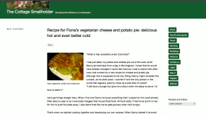
Here are three screenshots – thank you very much,Celia -from a Mac laptop . .
These are intended to give you an idea about how the site should appear. If it looks different on your browser then plaease tell us. Obviously it will be different on small screen devices.
Update Sat May 12: Well, I have to concede that this new theme/layout is simply not good enough, as many of you have pointed out.
It does not work on IE8 and looks horrible on a screen width of 1024 (thanks, Simon). Those two factors alone mean that over 20% of our visitors either cannot get onto the site or have a bad experience.
Thank you very much to everybody who took the time and trouble to test it out and leave a comment with feedback. A true community effort!
Today I will research better alternatives, so expect some more changes but then we stop changing, hopefully, for the next six years.
Update Mon May 14 2012
This theme/layout that we installed on Saturday is far better. It will take a few days to get it working and looking exactly as we want but so far so very good.
Leave a reply


“Win £50 worth of B&Q vouchers” was the info my feed gave me – so I nearly didn’t open as, not being in the UK, they aren’t much use to me. Well, being curious in any case, I opened it – wow, what’s that?
I like it – using a regular laptop – don’t know what the specs are, sorry! The photos are brighter and clearer, much better quality and I can read the text without my glasses. I do understand the earlier comment about it not reflecting the warmth of Fiona’s writing, but at least I can read it effortlessly, and readability is (nearly) as important as content.
Was the BBQ info a post, or an advert? I think that was the confusion above. My opinion is that it’s an improvement – I’ll see how the feed subscription info goes and report back here.
Not a great fan of “read more”, but that’s not so important – you will, though, need to get the reader’s attention in the 1st paragraph if they are going to be tempted to do so.
Hi Sally
Thanks for your comments! Danny has been working on a new look for CS for a long time now and all the feedback is useful.
Re the Grand Draw – I think this is what is called an advertorial post. We only accept these on CS if they include a genuine competition for our readers with a decent prize. It’s an alternative to taking out a text link/banner ad on our site. Of course D and I have to agree with what they are promoting 🙂
Good point about ‘read more’, thanks.
Hello Fiona,
Not sure my comment was very clear. Not wishing to miss a post, I subscribe to Cottage Smallholder and it comes in email form just with the title of your post. In this case, B&Q vouchers. Even though I could not use the vouchers, I opened the email. On the left handside was the voucher post (which actually does look like an advert), and on the right handside, Danny’s post asking for feedback. The whole did not appear as two separate posts. (Regarding your integrity re which products the Cottage Smallholder talks about…………. I have total trust – total!) This two column format also squashed down the recent comments, previous posts info.
Works fine on XP SP3 and Firefox!
Prefer the “New” Clean-look!
Thank you, Nick and Jean. Much appreciated.
It looks fine on my Mac and iPhone
Looks fine in W7 using IE9, Chrome 180.1025.168 and Firefox 13.0
Sorry Danny but it looks a mess on my pc screen (Windows XP). The adverts are now completely dominating the left hand side of the screen, squashing the blog column in the centre/right. Wouldn’t encourage me to read it in this format I’m afraid.
Wow – that’s unusual, Izzy. The adverts are supposed to be totally on the right.
Can you tell me what your browser is?
Maybe there is a Help menu option near the top – if so, clicking on it may show an About option that you can click on for more info.
That would help greatly.
Many thanks,
D
I have the same issue as Izzy on my PC. Windows XP and firefox. Hard to spot the blog for the ads. I have no problems with the ads being there, it just seems that with the layout the ads are more important than the blog and they are not why I drop in here. If it wasn’t for the fact that I do enjoy CSH and know you are trying things out, I wouldn’t be coming back. I tend to work on an “if it ain’t broke, don’t fix it” basis with most things and I’m not sure that fiddling with settings this end is the answer if the change is due to something you are doing.
The page looks much more minimal and will take some getting used to. I am using a standard laptop running Windows XP
Thanks, Sandra.
You are right – it’s a bit too minimal but we will tweak it bit by bit to achieve a reasonable balance, I hope.
looks fine on my bog standard laptop running on windows vista
Thanks for that, Barney.
Hi Danny,
This looks really nice and clean on both the MacBookPro and iPad, the only thing that doesn’t work is the embedded video on the iPad as Flash is not supported on (any) iPad. I am using Safari as the browser on both machines.
All buttons in a line and no issues with sending this msg (I hope)
Oonagh
Indeed, Oonagh. I wonder if Apple will ever permit Flash on their products. Methinks common sense, public demand and commercial interests may change affairs over time after the departure of Steve Jobs. We shall see.
Thanks for the positive feedback. Very good to hear.
D
I can’t see the right hand end of the line I am typing when I post, and couldn’t send a PM on the site because I couldn’t see the button that says Send! I am using a Mac and Firefox, and haven’t tried it on my Kindle yet.
I saw your comment regarding posting in the forum, B.
Yes, it is something I want to attend to as a priority this evening because it is frustrating
But first to do some shopping and haul a barrow of manure or five on the allotment.
Thanks for the feedback.
D