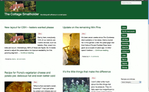
New layout for CSH – testers wanted please
Posted by Fiona Nevile in Cottage tales | 89 comments
Photo of our Cottage Smallholder cottage from the air
Danny here, everybody.
14% of our visitors use mobile devices, such as tablets, iPad, smart mobiles and so on. Interestingly, 85% of those are Apple.
So it makes sense to adjust the presentation to improve readability for this growing segment while ensuring that users of normal computers and laptops remain unaffected.
The site looks very different since we made the switch at 07:30 this morning but the content remains the same.
We would very much welcome comments here on this article from mobile device users and “normal” computer users alike. Even if it’s just to say “looks fine on my xyzsuperwotsit” or “the buttons are way off the screen on my abcamazatron”.
Desktop and laptop users can partly simulate what it looks like on a smaller screen device by making your browser window smaller and resizing it by dragging the edges. If you don’t know how to do that then don’t worry. It is not necessary to try it.
Edit: Friday May 11
Some visitors have observed unusual manifestations!
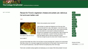
Here are three screenshots – thank you very much,Celia -from a Mac laptop . .
These are intended to give you an idea about how the site should appear. If it looks different on your browser then plaease tell us. Obviously it will be different on small screen devices.
Update Sat May 12: Well, I have to concede that this new theme/layout is simply not good enough, as many of you have pointed out.
It does not work on IE8 and looks horrible on a screen width of 1024 (thanks, Simon). Those two factors alone mean that over 20% of our visitors either cannot get onto the site or have a bad experience.
Thank you very much to everybody who took the time and trouble to test it out and leave a comment with feedback. A true community effort!
Today I will research better alternatives, so expect some more changes but then we stop changing, hopefully, for the next six years.
Update Mon May 14 2012
This theme/layout that we installed on Saturday is far better. It will take a few days to get it working and looking exactly as we want but so far so very good.
Leave a reply


Works fine on my iPhone Danny.
And on my Mac with Firefox it’s OK but can see Veronica’s point re the ‘ragged’/ranged left menu. I like raged left (as a typo geek) but here the effect is slightly messy – probably because it ranged left on a narrow column on the right, but the column isn’t visually defined by other elements (does that make sense?).
I know white is the new clean layout and all that, but in my opinion it’s a bit empty looking and needs an injection of something visually “warm and friendly” (reflecting the articles Fiona and you write) such as a selection of photos down the left side or within the header?
I’ll shut up now Danny
C
x
Your comment regarding the “hanging nav bar” with no visual guide provided by another element may be valid, Celia.
I wonder if that is a Mac specific thing, or is it subjective. It’s not something that struck me, TBH, which is why I posed the possibility.
But when a professional designer like you makes an observation, we definitely listen.
And yes, the clean white space is certainly startling! Something of the arctic about it. Maybe a few fluffy baby polar bears. . 🙂
Many thanks, C.
. . and thanks for sending the screenshots from your Mac, Celia.
The vertical nav bar looks the way it was intended to, which I accept stands out from the norm these days.
However, I guess the bottom line is – would it offend visitors to the extent that they might not return, and I think not.
But the general appearance needs a bit of work. Maybe we will be 98% there after the weekend.
I like these indented comments – threaded comments I think they are called. We did not have them on the old layout.
works in IE9 on Win 7 machine…….
Hmm, it appears to break IE8 – will not even load into the browser.
At least not on my laptop config running on XP.
Update: confirmed via email by GS
Sorry to report that your website now crashes my browser!
I’m running Windows 7 IE8 on a hp Probook
Excellent work, Agent 5olly. Top notch mission accomplished.
I was wondering about IE7 especially and Win7 generally.
We would be delighted if you can try out some more if you have time to spare this evening.
Hi Danny.
Looks good on my iPhone 3Gs in both Safari and Opera.
Looks good on my Windows 7 laptop as well with Chrome, Firefox & I.E 7
Also looks fine on my Samsung Galaxy Tab using Chrome.
I can have a look on my mac book when i get home if you still need it. We also have some more devices there we can trial. 🙂
I must say, it’s alot less cluttered and very nice!
5olly
I had a look at it on Kindle, for the first time ever, it looks fine but I wouldn’t want to post on the forum using that device, way too slow for my liking.
Another device tested OK. Thanks TA.
The forum is a whole different ball game! It is tricky to incorporate non-blog functionality but hopefully we will get it all sorted quickly.
I was keen to get it up and tested at maybe 80% complete.
Everybody is being so helpful. It’s great.
he just checked it out – he said with the HTC One X it looked fine on Chrome, the standard icecreamsandwich browser, and dolphin. hope that helps! xx
Keth – that’s absolutely brilliant. Much appreciate you taking the time to execute all those tests for us, and for roping in OH.
TBH, I am such a Luddite that I never heard of the dolphin browser but delighted to know that it is happy too!
Danny – you’re welcome!! I dunno about being a luddite – i hadn’t heard of it either, before i had my new-does-everything-but-make-the-cawfee-phone!! i’m a bit of a stick in the mud when it comes to browsers on computers.. firefox all the way for me!! 🙂 glad it helped though!
PS it looks fine on my chocolate teapot, aka Samsung Galaxy II phone, as well. It’s called the chocolate teapot because I’ve had it for 2 weeks and thanks to Orange I can’t yet use it to make phone calls.
Hi Danny
I made my Chrome window wider and got the same raggedy, I mean “new aligned” 🙂 look as in my other browsers. In all of them, the recent comments, recent articles, and blogs we recommend are now pushed down below the comments. There’s a big empty space on the right where they would normally be, and the header is very, very empty. :-0 I can understand wanting to optimise it for mobile (it looks OK on my iPod), but you can do that without making it look so strange on a full-size screen!
Fair comments, Veronica.
I have a good deal of tweaking to do along the lines of your observations. The old layout was very full and, I thought, became too cluttered of late. The new one currently has too much waste real estate at the moment. There will be a happy balance I hope!
This theme comes with two widgetised areas (I may add more myself) with the main one being below the comments before the footer. The Recent Comments etc. have been moved there temporarily but some may move back to the right-hand sidebar.
The header is too deep, agreed. Blame my weak CSS skills and the quite complex stylesheet of the theme. I will ask the theme author for a little help on the finer points. I am pleased with the code under the hood and with the documentation. It’s a bargain for 12 Euros IMO.
just tried it using the Dolphin browser on an android phone (samsung galaxy SII) and its very readable. all bunches up along one edge (left), but is easily expanded via my fingers and very readable. better than the old design for me!! i like it on my computer as well (firefox on linux). i can check IE on windows as well later if you need – my uni lappy runs windows. yell if you do.
I can ask my OH to check it on his phone as well – HTC One X, and i think he’s still deciding what browser to use so he’s got a few on his phone… xx